IHT, again
The IHT was one of my favourite news agencies but the last few changes that they've made have all had negative impacts (for me). Here's a brief summary of the changes that I've noticed.
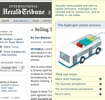
First was the redesign that they went through earlier this year, increasing the advertising area on the front page, thus by limiting the amount of worthy content.
Secondly, as I previously noted, they've also adopted a subscription model limiting access to content that I'd probably be able to get at NYT or at another of their partner sites.
Finally, they now have the flash advertising banner rolling-down to cover the page once you mouse over it. The opposite action of moving your mouse out of the advertising area doesn't roll-up, you need to click the close button to do so.
So, other than ranting about what they've done what is the purpose of this post? Not a single one helps me as a user of their website.
