kilic.net logo
- Posted in:
- weblog
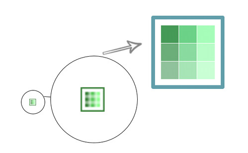
I’ve started tweaking some aspects of this weblog, starting with a refresh of the logo. The current design (which is been with me for several years now) looks dated, low quality, and a bit uninspiring. I’m a developer first! You can see transition of the old to new logo in the image below:

The new logo has dropped the border around the icon, introduced a modified colour palette, and also introduced a transparency gradient originating from the top-left corner to the bottom-right corner.
As any web developer would know, you just don’t have a single icon these days. With such vast array of platforms these days they have their own way of displaying “favourite” icons. As of now, I’ve specified a good old Web 1.0 favicon.ico, an iPhone icon (using the apple-touch-icon meta tag) and also for the Windows 8.1 devices, a whole range of logo sizes to suite the Live Tiles format. The Windows 8.1 icons are specified in my browserconfig.xml file that’s referenced via an msapplication-config meta tag on this page.